
Robbing apps and glances to pay notifications
· 3 minute read
Here’s a verdict that shouldn’t be surprising: Apple Watch users are most enthusiastic about actions that either come to you, or require as few taps (and as such, as little interface) as possible. Anything requiring more time and attention can be fine, but certainly doesn’t feel like the ideal way to use the device. Put another way, notifications and complications are what make the Watch a joy to use. Glances and apps are occasionally useful, but for the most part are not where you want to be spending too much time.
Being notified about something is nice, but being able to act on it right from the notification UI itself is extremely powerful, and a key part of a great Apple Watch experience. Interactive notifications seem underutilized on iOS – likely since they aren’t particularly discoverable – but they’re front-and-center on the Watch. Someone requests a Venmo payment from you, and you can pay them right from the notification1. It can’t be overstated how important it is that interactive notifications work right out of the box on Apple Watch, without requiring the app’s developer to build anything specifically for the Watch. If you already had them on iOS, they simply became that much more useful overnight when early adopters started receiving the first Watch shipments.
WatchKit does allow developers to build custom, enhanced “long-look” notifications, as well. Here’s what Uber’s looks like – it simply shows you a preview of which car you should be looking out for.
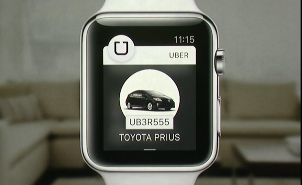
Unlike interactive notifications, receiving these long-looks requires having an app specifically installed on your Watch, highlighting a discoverability concern: there’s no way for you to know whether a Watch app comes with enhanced notifications or not. Many of the apps I have on my phone include Watch components, but I haven’t installed most because I don’t want to have too many apps on there. Less is often more, especially when considering how rapidly the Watch’s paged glances and honeycomb app grid decrease in usability as the number of apps in them increase.
That said, if I knew that a Watch app came with notifications that would allow me to actually take more direct actions or view additional information, I’d be much more likely to give it a shot. It seems like the best way to find this out is to simply install and wait until notification are received, to see if any custom long-look capabilities are being taking advantage of. Including a long-look notification as part of your app’s App Store screenshots could go a long way, and I wonder if there’s an opportunity for Apple to adjust the store pages to be more informative about which Watch capabilities a given app is taking advantage of.
That said, another way to attack the same problem would simply be to make having a lot of apps installed on your Watch be less unbearable. I’d love to see glances be able to hide themselves when they don’t have anything pertinent to show, much like how Today widgets behave on iOS2. This would allow users to have more glances enabled, knowing that they’ll only have to scroll through those with pertinent information at any given moment3.
Unfortunately, I don’t think this change could be made without first modifying the app honeycomb. In it’s existing state, the honeycomb becomes so unavigable with a large number of apps that glances end up becoming repurposed as app launchers4. As inelegant as it sounds, folders or some other way to bury apps that will rarely, if ever, be launched from the honeycomb (e.g. those installed purely for notification purposes, or built-in Apple apps that you simply may find uncompelling) would go a long way.
It’s far from an original thought, but notifications are arguably the “killer” Apple Watch feature that many have been looking for. If changes to the (far less important) glance system and the app launcher improve the experience of having a larger number Watch apps installed, and as such, provides users with richer, more actionable noticications, I think the Apple Watch becomes a far more compelling product.
-
My personal favorite: when I connect to my work VPN, I can easily approve the two-factor authentication request on my wrist. ↩
-
FlightTrack is a perfect example. It’s incredibly useful in both iOS Today widget and watchOS glance form, but couldn’t be less interesting when there isn’t a plane that you care about in the air at this exact moment. ↩
-
I’d love to see third-party complications work this way as well, though it’d definitely have the potential to get confusing quickly. But maybe I want a sports score complication while a game is going on, but my calendar otherwise? This kind of flexibility could decrease reliance on glances as well. ↩
-
Swarm is the app that I primarily use this way. Checking in from your wrist is quick and easy, but I only ever get to the app by tapping the (otherwise uncompelling) glance. ↩